

Microsoft has openly admitted that the right-click context menu in Windows 11 has not worked out for the better.
Ironically, when Windows 11 was launched back in 2021, Microsoft said at the time that the Windows 10 context menu had become too long and difficult to use, hence the new context menu in Windows 11.
I say “ironically” because the context menu in Windows 11 is much longer and more difficult to use than the Windows 10 context menu, requiring an additional click to expand and access many of the options.
(Windows 10 context menu) (Windows 11 context menu)

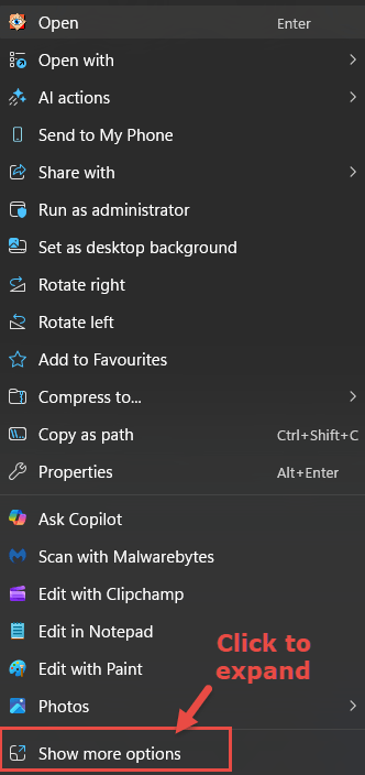
Once again, Microsoft’s reasoning is difficult to comprehend.
Microsoft highlighted what the company believed was wrong with the Windows 10 context menu, stating that it had grown in an unregulated environment for 20 years, since Windows XP, with common commands such as Cut, Copy, Paste, Delete, and Rename too far from the cursor. Adding that the menu had become exceptionally long, with rarely used commands mixed in with common ones
Microsoft has now issued an eerily similar assessment of the Windows 11 context menu, stating that it has become cluttered and sluggish. Virtually admitting that the Windows 11 context menu has developed the exact same issues it was supposed to eliminate. Although, as far as I am concerned, it started off way too long and cluttered in the first place.
- You also might like: How To Restore Old Context Menu In Windows 11
Microsoft’s New Windows 11 Context Menu
The good news is that Microsoft has redesigned Windows 11’s context menu with the new format now available via the Insider Experimental build program.
According to reports, the redesigned context menu is now shorter and includes customization options to:
- Switch options – such as Send to, Print, Create shortcut, Copy as path, and Rotate image – on or off individually
- Show app extensions in the main menu, tucked away in a sub-menu, or completely hidden
- Control how common commands are displayed via a range of layout options
And possibly the best part is that this redesign makes the right-click context menu overall more responsive.
BOTTOM LINE:
I guess one could rail once again about Microsoft’s inexplicable decision-making, but in this case, I prefer to praise the company for at least admitting its mistake and taking the right steps to rectify the situation.
As always, your thoughts via the comments are most welcome.
—

Thanks Jim
Microsoft were told by Users at the time who complained vociferously about the hated context menu changes and the hugely annoying “two clicks” to accomplish what previously had taken just one. I read the articles. They were told loud and clear. But of course Redmond knew best, ignored their customers and now they just look even more silly trying to change it back around to something that hopefully will actually work if we are lucky. At the time and following a lot of frustrated annoyance I managed to find a registry hack to put the one-click back the way it was and have used it ever since – I have never had to suffer the consequences of their obstinate stupidity.
I am happy that you seem a kindly, charitable kind of guy Jim towards Microsoft’s acknowledgement of the context menu “unpleasantness”. You sound like you would make someone the ideal next-door neighbour – forgiving them even after they reversed their four wheel drive over your beautiful flower beds that you had just spent weeks cultivating to perfection. However I bet you didn’t find an actual admission of guilt from Microsoft admitting that they “got it wrong” and a mea culpa. This old Crusty Crustacean on the other hand says “Serves you bloody well right Redmond – now do the walk of shame !” 🙂
Cheers
Reg
Hey Reg,
Yes, we published an article some time back on how to restore the legacy context menu via a registry hack: https://davescomputertips.com/how-to-restore-old-context-menu-in-windows-11/
Another method is to simply press and hold the Shift key while right-clicking.