
Charting data entered into an Excel spreadsheet does not have to be a complicated procedure. This article shows you step-by-step how to make that happen. First, we will create a simple worksheet and add some random data. Then we will create a quick chart of that data.
Open Excel to a blank worksheet.

Create some data to demonstrate with.
To enter today’s date, I used the shortcut Ctrl+;
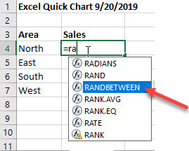
One of the many available functions is RANDBETWEEN. We will use it to enter random values for our demo. Click on cell B4 and begin to enter the function by typing =ra. A list of functions starting with ra pops up. Select RANDBETWEEN.

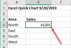
Enter the range of values you want, low comma high, then press Enter.
Now click on B4 and double-click the fill handle to copy the values down. Notice it generated additional random numbers.

After copying the formula down, we will add a total. Click in B8 and type Alt+= to generate the SUM function summing the numeric cells above it. Press Enter.

Click on the column heading B to select the entire column.
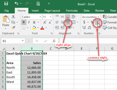
Right-align and choose comma style to format the values and line up the column heading.
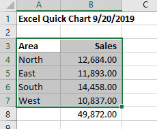
Select the data to be included in the chart.

Press F11 to have Excel generate a quick bar graph. Use the tools on the Design ribbon to change the type of graph, the colors, and more. Or just use it as is.
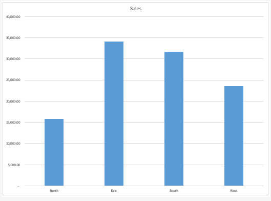
The values are on the left of the chart and the area names are across the bottom with the bars above them.
In this demo, we learned how to auto-generate a date field, create random values, auto-sum a column of values, format an entire column of data, and generate a quick chart.
Dick
—
Unless I misunderstood what was being explained, the main takeaway from this article was that you can create a quick chart by pressing F11. Why was so much space taken up with creating some data to put in the chart?
Yes, F11 was the main takeaway. There were a few other things thrown in. I guess my teaching background created a little more than a single takeaway that might be useful to some less experienced Excel users.