I’ve been with WordPress for three or four years and I’m always learning something new. I also need to stay on top of managing the websites because skill-fade is very real and I often have to scratch my head, mumbling “How did I do that the last time?”
Keep It Simple
At first, I would overthink and assumed that what I wanted the site to look like would be what the Internet wanted. That’s not how it works and I now think more objectively. This is why I redesigned two of my websites with a minimalist theme.
Use Drop-Down Menus
DCT uses drop-down menus because when you mouse over the menu, some of the items have a down arrow. This keeps the front page tidy with fewer items to work through. Imagine a restaurant, where the menu is the size of War And Peace when all you really want is a ham sandwich and a cold beer.
Try A Floating Menu
This website uses a floating menu so that when you scroll down, the menu is sticky and appears to float. I adopted this style for my Expats forum as it also helps to navigate the website.
Use Fewer Plugins
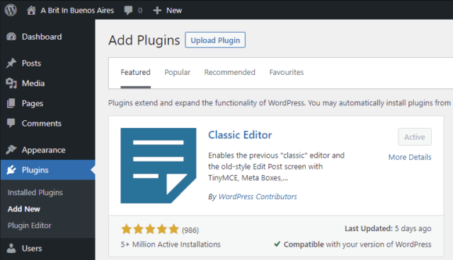
Plugins are very useful for achieving what a default WordPress installation may not offer, but don’t install every plugin you come across or the site will slow to a crawl.
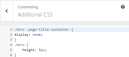
Use Additional CSS
For example, I needed to change aspects of a header image so I popped some code into additional CSS. When in doubt, always ask in the WordPress support site for the theme that you’re using.
Don’t Get Hung Up On Social Media Buttons
I became too absorbed with throwing social media buttons all over the place but realised that I was sending visitors away from the website. Attention span on the Internet is measured in milliseconds, so it’s important to keep your visitors captive with a minimum of distractions.
Keep Your Website Alive
Managing websites is similar to gardening — care is needed if you want to keep visitors interested. This site shows all the latest articles posted because it’s dynamic. On the other hand, my Compufix site is static because it’s largely informational. There’s nothing worse than visiting a site that hasn’t been updated for years.
Use A Favicon
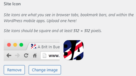
This is the tiny image you see on the tab of a website and is a way of instantly recognising what the site is and who it belongs to. Most themes will have a function for adding a favicon in the customise area.
Use Lightweight Images
The maximum recommended size for images is around 100KB. This helps take into account any visitors who may have a slow Internet connection.
Make It Easy For Visitors To Contact You
If you’re not running a clandestine black ops site, you should make it easy for people to get hold of you. This can be done with a simple menu item or button link.
—
