 DCT has a long history of blue. Not feeling blue, but being blue. From the beginning – way back in 2006 – we’ve had a generally blue color scheme. If I were to embellish the story a bit it would be a tale involving a night of drinking, a box of Crayons, and an impromptu game of Pin the Tail of the Donkey. In reality it is not for any other reason than it’s a pleasing color, and one of my favorites, which isn’t nearly as exciting.
Over the years we’ve gone through four major “rip out the carpet and walls” renovations, and I believe each has been a major improvement over the previous iteration though I may be looking at the situation through rose colored glasses. When we moved to the current design in 2014 I was looking for a major change. You know how it goes; “move this picture!”, “move the couch over here!”, and “Hey, lets paint over these blue walls with orange!” OK, I may have not had that much inspiration, but I did want to see how the site looked and felt without blue.
Here we are almost two years later and – well how can I break this to you – we’re blue again. It feels like that well worn pair of jeans you always find yourself wearing. Comfortable. I don’t want to think we took this major life altering decision lightly. We researched the interwebs for weeks, weeks I tell you! OK, days. Well, it was actually a few minutes, and we found this wonderful description of the color blue from Color Wheel Pro:
Blue is the color of the sky and sea. It is often associated with depth and stability. It symbolizes trust, loyalty, wisdom, confidence, intelligence, faith, truth, and heaven. Blue is considered beneficial to the mind and body. It slows human metabolism and produces a calming effect.
Boom! I could not believe how well that described DCT, our readers, and our mission.
- Stability – we’ve been here for almost 10 years, and that’s twice as long as my first marriage!
- Trust – we hope you trust us.
- Loyalty – we’re loyal like a puppy.
- Intelligent – well this may be open to interpretation and we’ll leave it at that.
- Truth – we tell it like it is and don’t sugar coat it.
- Calming – we’ve all been moments away from smacking a computer with a sledge hammer so this can’t hurt.
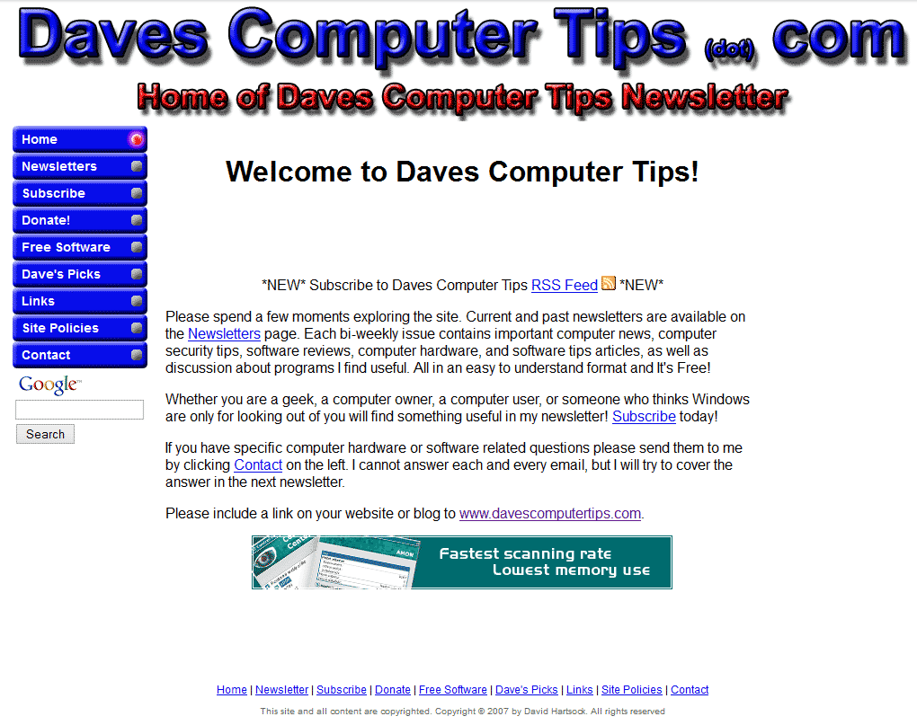
So now that you’ve been bamboozled by my witty banter here’s a look at the past. Oh yeah, sign up for our newsletter and help me put the couch back where it belongs.


Works for me!!!!
Thanks to all of you for your efforts to help me make our way through the complex computer minefield.
You are very welcome, Bill!
Like it – has a modern look to it!
Ditto Bill’s praise!
Modern, yet plays homage to our past! 🙂 Thanks Jayesstee.
Personally I prefer Royal Blue, but whatever your choice of blue is please bold and underline it. That way people like me who use monochrome laser printers can print your articles if they feel like it and have the links stand out.
I like the blue color better. This really gives it I nice feel 🙂
Thanks, Jason.
that new colour scheme and a BIG cuppa tea keeps me warm and fuzzy! Nice going mates!
Glad you’re fuzzy, but are you sure there wasn’t something “special” in that tea? Just kidding. Thanks for the complement, roo!
Blue is my favourite colour and if I can change a colour eg; (outlook.com) I change it to suit.
Nice one Dave ….. 🙂
Thanks JoninOz!
I’ve been a fan for a few years now, and it was fun to see the old designs. I like the new look. Well done!
Thanks, Dan!
As a web designer myself. I love the color change, the orange popped and was attractive but the blue is inviting. WTG Dave!
I must say that the blue on black, looks great, but it is much harder to read than the blue on white. But then again it could just be my old eyes.
Details, details, details. Had you not mentioned it Dave, I (and maybe a few others) might not of noticed anything (for some time). 🙂
Well done, Mindblower!
Thanks, Mindblower!
Keeps getting better.