A Weird Site Redesign
A few weeks ago I tuned into Netflix to catch up on Henry VIII and his bodice-busting antics in The Tudors only to find that the good people at Netflix had seen fit to ruin the interface and for me to emit a loud what the….f***! It’s worth mentioning at this point that at the time of writing I’m not able to reproduce the truly horrible interface they were trying out, so I’ll have to describe it with some words and pretty pictures instead.
The picture above is what we see when the mouse is hovered over the desired feature and the down arrow reveals further information about the film/series/documentary, but then you all know that already don’t you?
Nice and simple and totally user friendly as you’ll agree. However, with the horrible interface Netflix was trying out at that time, the only way to access more information on the program appeared to be by actually playing the content (since the down arrow and PLUS sign were missing), then pausing it, denying anyone the opportunity to review the content before playing it. This seemed like a very bad redesign to me and I’m pretty sure it wasn’t completely a result of me losing my marbles as it was happening across all my PCs.
Opt Out of Netflix Testing
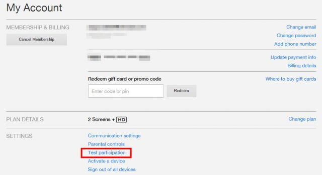
After a little searching around and with no little help from Google, I discovered that you can opt out of Netflix Test Participation by doing the following:
Hover your mouse over your name in the top right corner and click Your Account.
Then click on Test Participation, located in Settings.
This will then take you to the Test Participation page, where you can choose to opt out of betas, tests and reviews.
That’s it, job done!
Now, it’s entirely possible that the horrid interface I saw was a glitch at my end, in which case this How-To is academic. However, it fixed the weird test page and returned our viewing to the default setting with its clean and easy to use interface.
—


Thanks for that fix.