ClearType is Microsoft’s implementation of subpixel rendering technology in rendering text in a font system. ClearType attempts to improve the appearance of text on certain types of computer display screens by sacrificing color fidelity for additional intensity variation ~ Wikipedia
Clear as mud? Put simply, ClearType can help sharpen fuzzy or indistinct text. ClearType has been a part of Windows since XP but was significantly improved in Windows 7 and has been enabled by default since Vista. However, because of the varying levels of eyesight and color sensitivity between individuals, for some users the default settings may not always be as sharp or legible as they could be with a little tweaking.
How to calibrate ClearType in Windows 7, 8.1, or 10
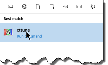
Step 1: Type cttune into the Start Menu’s search box – in Windows 8/8.1, you’ll need to open the Charms menu (Windows + C) to search:
Step 2: Click the item or hit Enter to launch the ClearType utility.
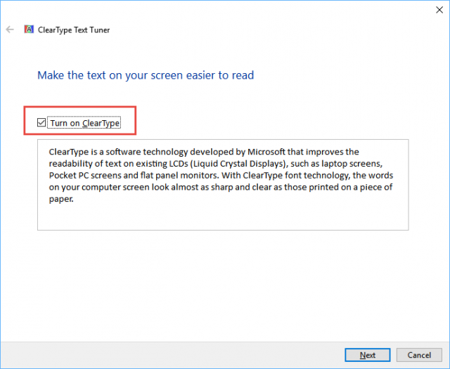
Step 3: Make sure the option to “Turn on ClearType” is enabled, then click Next:
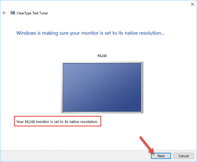
Step 4: Click Next again after the utility confirms that your screen is at its native resolution (which it should be in pretty much all cases). If not, you will need to adjust the resolution at this point:
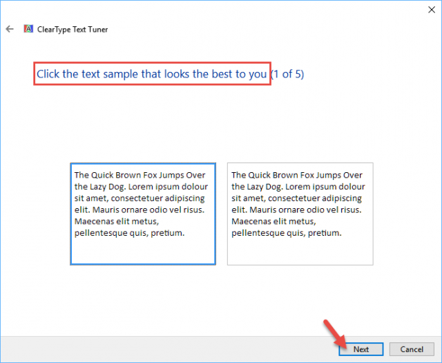
Step 6: Now you’ll be taken through a series of blocks of text where you’ll need to select the text that looks best to you. You’ll need to repeat this 5 times clicking Next each time:
Step 7: When you’ve completed the process, click Finish.
You should now see a vast improvement in text clarity.
—

Although Clear Type is an improvement, to really make windows fonts look super slick try
MacType – http://www.mactype.net. Its a free utiltiy and you wont believe the difference it makes