Improvements From Top To Bottom
Windows 11 has only been around a month or two and for many of you that is true. For me however, it is hard to believe that the first available release for Insiders was June 24, 2021, making it a year-old next month. Of course, the “official” release was not until October 5 of last year and just 7 months later Microsoft is ready to ship Windows 11 22H2.
There is no doubt that the Start Menu caused a lot of anxiety to users. Having it sit in the middle of the screen was too strange for many, myself included. I would constantly move my mouse to the bottom left of the screen to access start features for so long. From XP to Windows 10, I found myself opening the Widgets function all too often.
Fortunately, we could delete the Widget feature from the taskbar and justify the Taskbar to the left.
Start And Taskbar Upgrades
This new release has a ton of improvements, and many are focused on improving the user’s Start Menu + the Taskbar experience. For example:
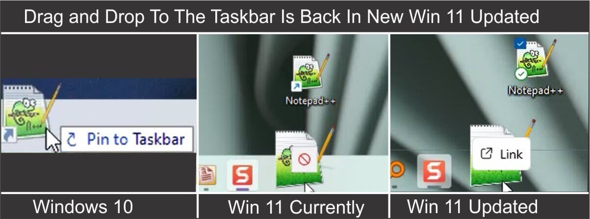
- Drag and Drop for shortcuts is finally back. Right-click on a shortcut and drag it to “Link” with the desktop

- Another option is to right-click on the Icon and select the traditional “Pin to taskbar” as you would any application
- Right-click on apps in the Start Menu’s Pinned Apps or in “All Apps” and pin them to the Taskbar as well
- The new layout for the Start Menu makes it easier to visualize Pinned Apps vs all Apps appearance as well as set which function suits you best. Setting > Personalization > Start

- Now you can organize your apps into a single folder to make the Pinned area less cluttered and quickly locate associated apps. Adding additional folders is not a problem. This is a feature that should never have been removed but now it is finally back. It can be a little tricky because the folder jumps around unless you manage to put the app icon directly over the folder icon

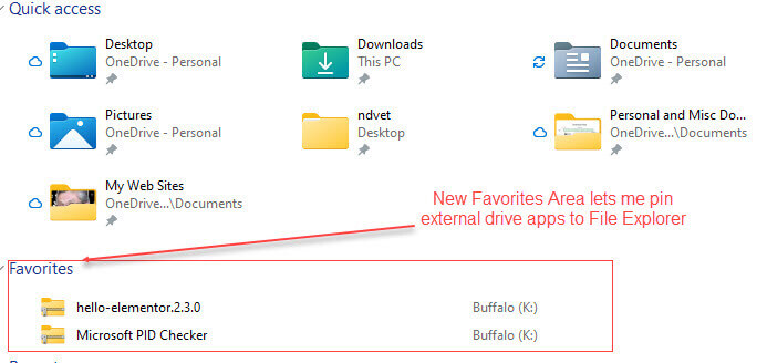
- File Explorer has added a “Favorites” area where apps can be pinned and located easily. This was done to help inexperienced users understand the more confusing labeled “Quick Access”


File Explorer
While I was sure that the new Tab feature for File Explorer would be in this update, it did not make it. But some important updates have been made to File Explorer:
We can now see folder contents again as we did in Windows 10.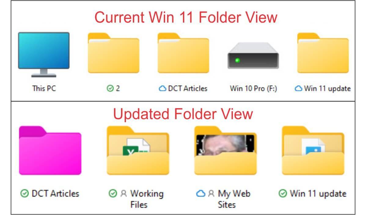
The function icons that are displayed in Explorer provided more of a color pop. While there is a visual improvement in the Light Mode, the icons look florescent in the Dark Mode.![]()
Managing Apps
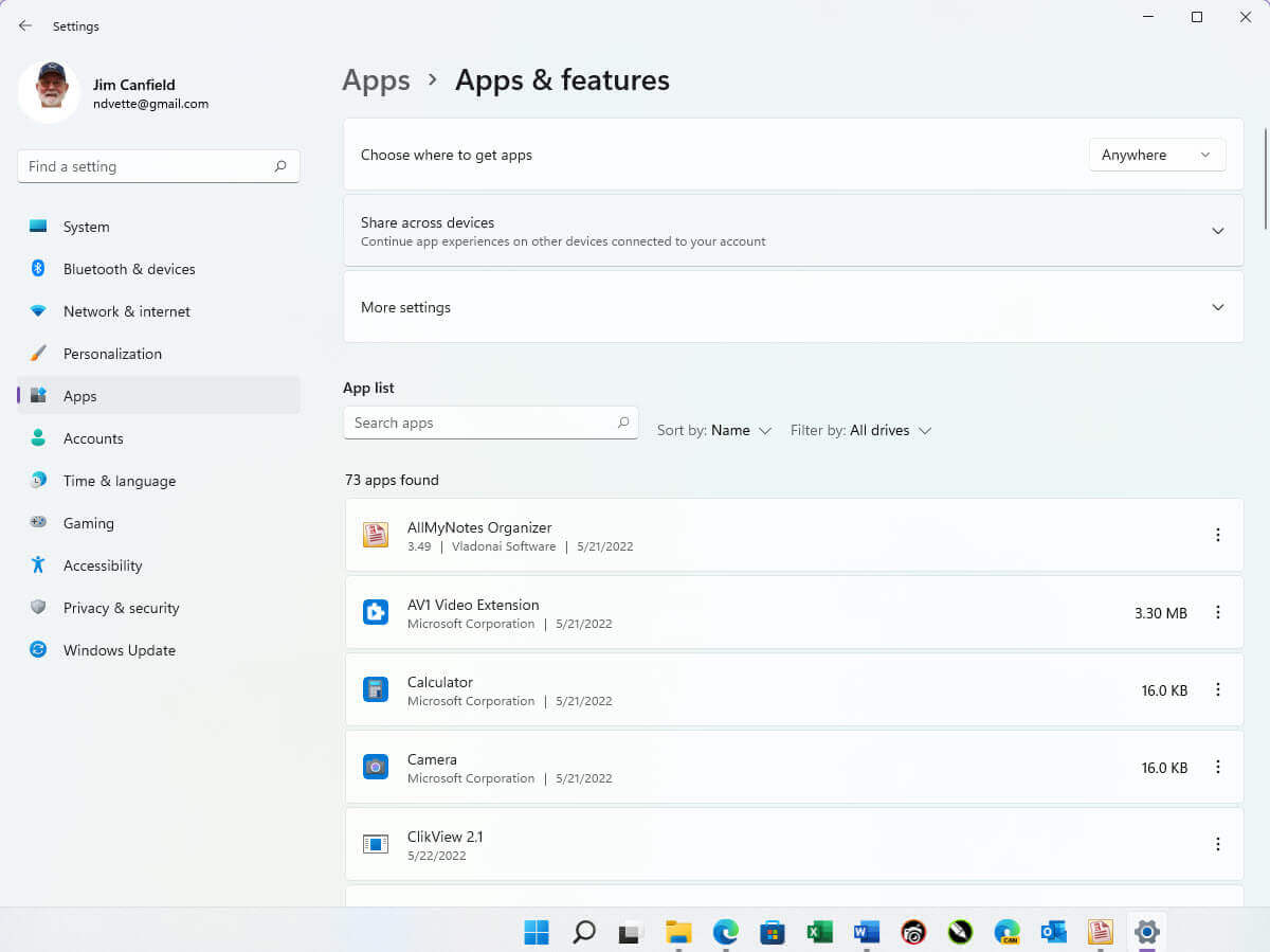
The old apps in Settings have been renamed to “New Apps & Features”. It gives you a better feel at managing your applications and Windows’ Features, defining default apps, and is just one more way that Microsoft is trying to ween users from using the Control Panel.
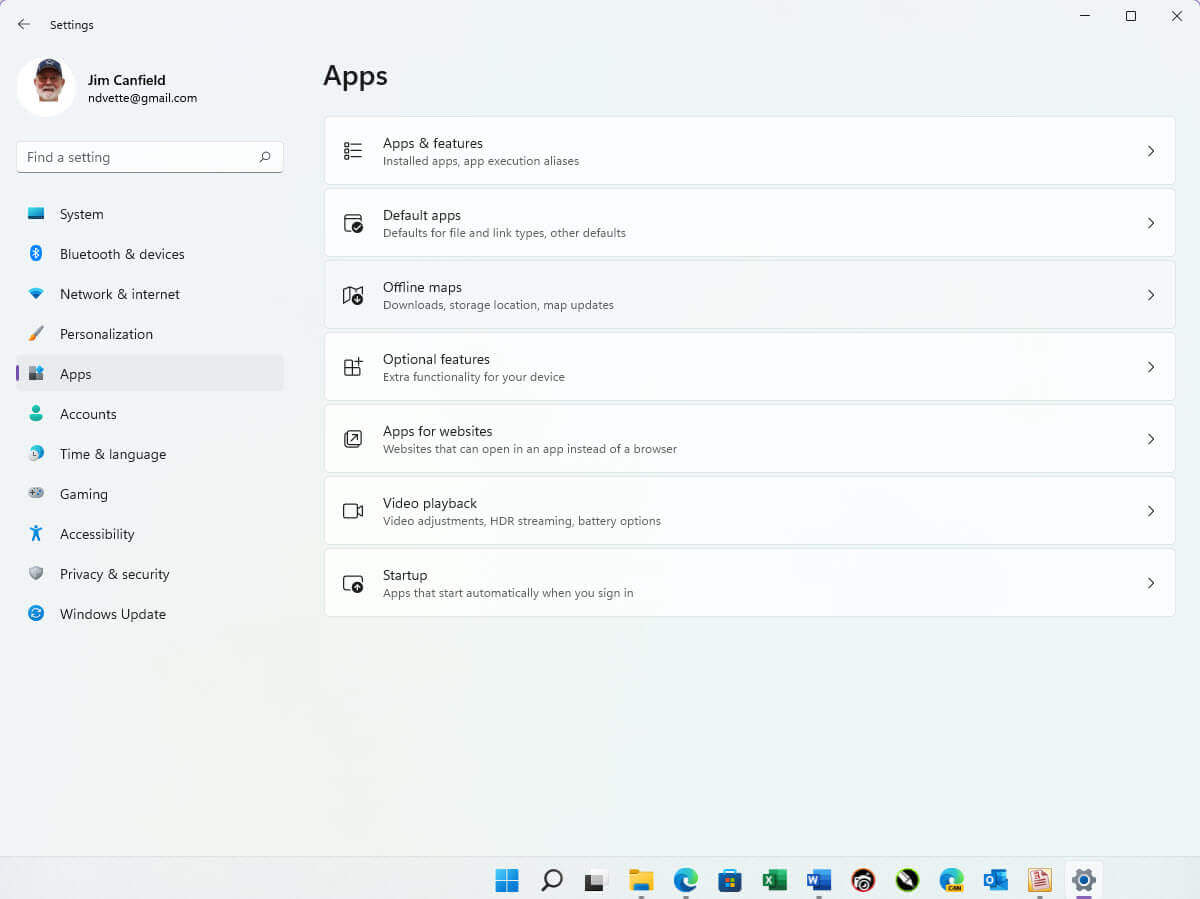
In the Apps & Features screen below, you can see how different they are when compared to the previous version.
Quick Settings
Some minor changes have been made to the Quick Settings. In the current version, you have to click on the Bluetooth icon and then Go to Settings to make changes and pair devices. 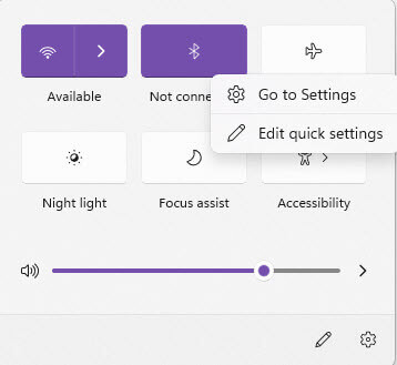
Now just use the greater-than arrow to open and scan all available Bluetooth devices. I find this to be a big time saver.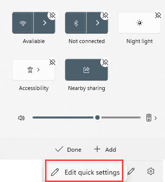
Task Manager
The Task Manager has made several visual and functional improvements. Instead of having the titles displayed as tabs on the top of the screen in the previous version shown below…
…they are now in a vertical row on the left. They also lost their labels and now only use symbols. You can, however, click on the hamburger menu icon and bring up the name associated with each icon. I am sure it won’t take long to memorize each icon with a specific function.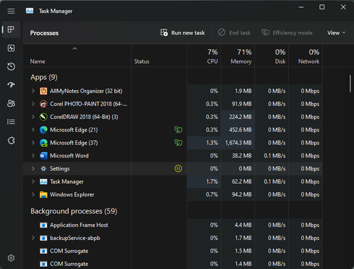
How the Task Manager looks when it opens is also a user selection.
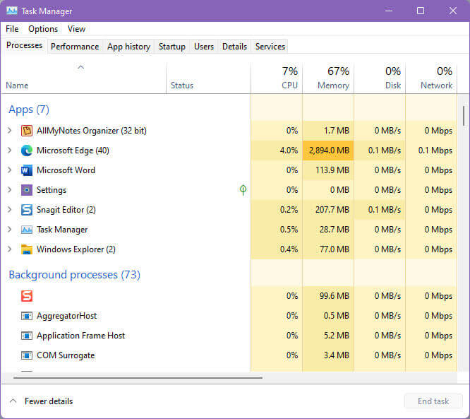
Efficiency Mode
Some apps are automatically selected for efficiency mode, in the image above, the green leaves indicate that the app is in efficiency mode. Users can right-click on most applications and put the app into efficiency mode, giving more resources to other functions. This is especially useful for gamers sharing a system with work applications.
Summary
Overall, I am happy to see the changes that have been made to this update. Most either improve productivity like the Drag-and-Drop to the Taskbar and the ability to add Folders to Pinned Tasks in the Start Menu. Some just make the program look more polished, like the rounded corners, functions icons, and adding color to the function icons. Some put adding computer efficiency right at the user’s fingertips by adjusting apps in the Task Manager.
—
THat task manager change is enough to prevent me from EVER upgrading to 11. it is supposed to be easier not harder to see & Comprehend things.