Usually, you only have two choices, Dark or Light.
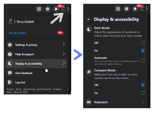
Click on your profile icon. Then click on Display & accessibility. Then click on Off (makes it light), On (dark mode on), and Automatic (uses whatever theme you have your computer set for).
Quora
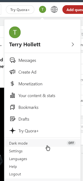
This site is something like Reddit. Click on the icon representing your profile. In my case a green circle with a white T inside. Then click on Dark mode.
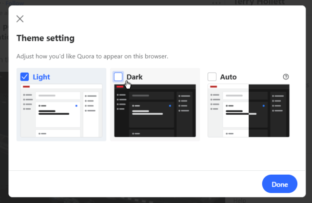
In the window that opens, again choose Light, Dark, or Auto.
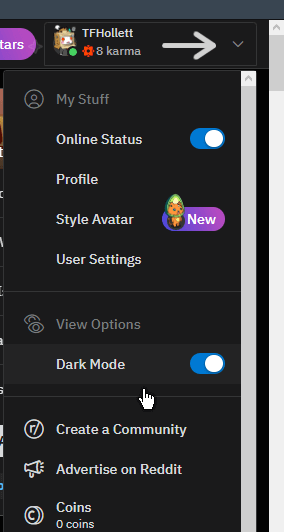
Click on the down arrow. Then click on the Dark Mode switch to enable or disable.
Down the left-hand side menu click on the three dots in a circle.
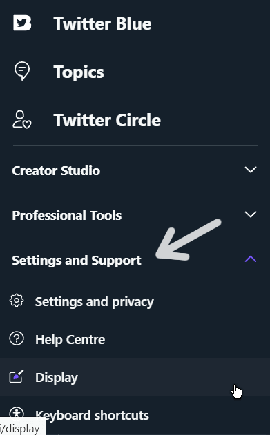
Now click on Settings and Support in the menu. You’ll have to click on this before you see the Display option.
Then click on Display
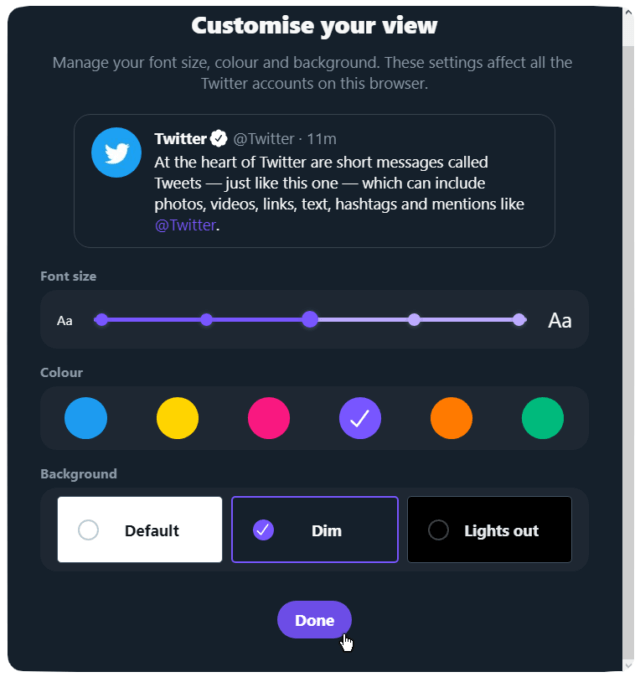
In the Customize your view window, you can change the font size, the colour of the buttons and links, and the background. You have three choices here: Default (white), Dim (kinda gray), or Lights out (black). Choose your weapons and click on Done.
I chose Dim. The black one is like the high-contrast black in the windows theme and too hard on my eyes.
YouTube
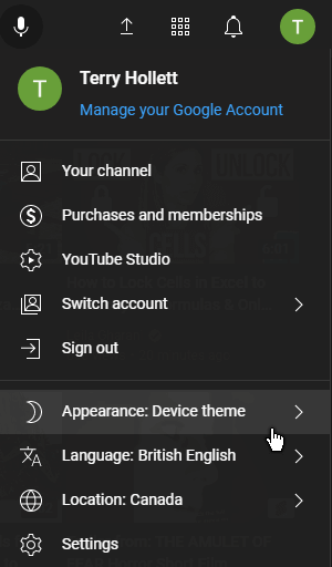
Click on your profile icon, again mine is a green circle with the white letter T inside at the top right-hand corner of the web page.
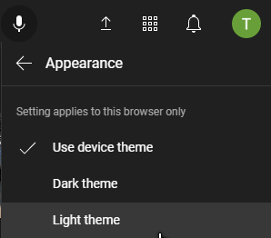
Then click on Appearance, Use device theme (yours might say Dark or Light depending on how it is already set). Click on this and you have three choices: Use device theme, Dark theme, or Light theme.
So Dark or Light – what’s your favourite theme?
And for more theme wizardry, click here.
—

