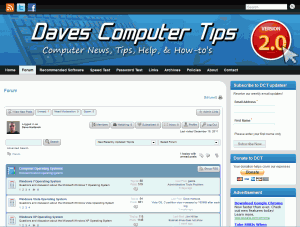
New look. Same great taste!

Over the past 5 years DCT has been through many changes. I think most of them for the better and I hope I’m not in the minority. Moving to a blog format in August presented quite a few hurdles and one of those was the look and feel of the site. At the time of the move we had an established forum that used a different software than that of the blog and it was easiest to make the blog “look and feel” like the existing forum. I’ll admit the look was a bit “dated” to say the least and others referred to it as plain.

One of the positives about moving to a blog was the ability to simply change the look, feel, and functionality of the site with a simple theme. One change affecting the entire site. Unfortunately due to the differences between the blog and forum software this was not a viable solution.

Since the launch of our new blog I’ve been searching for a solution that would address the appearance issue and allow us to integrate all site functions within one software solution. I found that solution in Simple Press. Simple Press allows us to move away from a PHPBB based forum and integrate that functionality directly into the blog thus opening a door for DCT to update our appearance and functionality across the board site wide!

Today I introduce you to the new and improved Daves Computer Tips. A more professional and mature look with quite a bit more functionality and capability for the authors – and I still get to keep my Blue!

The forum now resides “inside” the blog so we present one unified professional interface to you. We are still working out a few bugs so be patient over the next week.
Improvement? What improvements?
We’ve also added new authors to bring more computer and tech information to you! Please allow me to introduce to you Mike Conroy and Pat McMullen! You may have read a few of their posts over the past several days. I know they will provide you with the same level of enthusiasm and trust that you have come to expect from DCT. Leave a comment and welcome them to DCT when you read one of their posts.

Mike is an old computer guy from the DOS era (he boots up quickly though). Always up for a challenge and willing to lend a hand to a troubled computer user!

Pat is a recent college grad with PC, Mac, and mobile experience. His writing has a certain flair (he’s too good looking for our bunch – makes us all look old).

The new improved 2.0 look is great, with just one tiny tweak (if possible), the font size. I’m aware I can make the print size bigger at my end. My suggestion comes simply because there is room on the screen for such a fix, without wasting or adding any extra lines. All the best, Mindblower!
Hey Dave,
The site is looking better all the time, The 2.0 is a great improvement so keep up the great work
We’re working on it! I think I’ve sorted out all of the previous display issues with the forum, so we should be good to go!
great look for a great site.
But I go with mindblower. bigger size font please. I tried the font size thing on the right side, it wasnt working. did ctrl + ,
otherwise it is just gr8.