Windows 7 is based on an improved Windows Vista kernel, or core. Basically improved memory management and I/O processing. It isn’t a major change such as between Windows XP and Vista. Think Apple. Well don’t think too much about apple, but it is a good example of each new OS being a refinement of the previous. Windows 7 isn’t a major refinement of Vista. You could say it is more of a polishing and improvement of Vista. While this may worry some (I can hear the “I’ll never use Vista” humdrum starting already) it is not uncommon. In general this is a very good thing. It almost guarantees software compatibility between releases, while providing a more stable OS with updated features.
There were rumors that Windows 7 would ship with Microsoft’s new antivirus software, Security Essentials. While this may have appeared to be a good idea (every Win 7 user will have some protection), I see this as ‘letting the fox guard the henhouse’. Microsoft isn’t known for producing code that is small and doesn’t hog memory.Fortunately this did not happen and you may continue to use the anti-virus of your choice.
The fit and finish of Windows 7 is amazing, and a noticable improvement over Vista. The user interface is so polished that I wonder how I did any work with Vista or XP.
So what is different about Windows 7?
The differences that will be most obvious to any Windows user are right on the desktop. The taskbar is almost a complete redesign with some very cool functionality. The sidebar is also updated. Gadgets now set directly on the desktop. It’s a slick concept that I like, so let’s take a look!
Gadgets and Sidebar
In the image above you can see that the Windows gadgets no longer appear in a sidebar, but directly on the desktop. I like this, a lot! The Sidebar used quite a bit of memory on my computer. Running the gadgets without the Sidebar is probably a good 45MB savings. In Vista using the ‘show desktop’ button actually caused the sidebar to disappear also. It was an annoyance of mine, but not longer.
Windows 7 taskbar
The main difference you will notice is the taskbar. Gone are the days when 4 or 5 programs would fill the taskbar. The quick launch toolbar has also been incorporated directly into the taskbar, allowing you to ‘pin’ programs directly to the taskbar. Microsoft, by default, has eliminated the program name and will display the program’s icon only (this can be changed – see below). This is a decent trade-off between form and function. The taskbar has been increased in vertical size (slightly) to allow larger icons. Since there is no longer a quick launch toolbar, and some users didn’t use it anyway, they have made the Show Desktop function a permanent part of the taskbar and moved it to the far right. I think this is a smart and useful decision.
In the picture above you will notice that I have both MS Paint and the Calculator running. Notice the difference between those programs and the icons to the left. Running programs have a border applied to the icon in the taskbar. Programs that are not minimized, or showing at the moment, have a ‘glass’ effect applied to the icon. I also have 3 instances of the calculator running. No real reason but to show the taskbar indicates this too! Pretty neat, if you ask me.
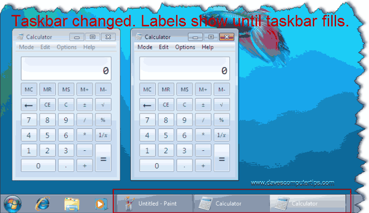
In the picture above I have changed the default taskbar to show the program name along with the icon. The same effects are applied, but it takes quite a bit more horizontal real estate. This may appeal to some, however if you multi-task and the taskbar fills with running programs it will revert to displaying icons only as in the previous screenshot. It’s not permanent and returns to your chosen setting once a program or two is closed.
Another new change, and a very good one, is called jump lists. In Windows versions prior to Windows 7, including Vista, right clicking on a program in the taskbar gives standard Restore, Move, Size, Minimize, Maximize, and Close options. Somewhat useful, but there is much more potential here! In Windows 7 Microsoft has allowed this menu to have program specific options.
You can see in the screenshot above that Media Player is running because the icon has a border. Right clicking the icon brings up the jump list. Gone are the standard ho-hum options. This is in it’s infancy. As more programs become ‘Windows 7’ aware this will become a very useful change in the new operating system.
We even get an updated Start Menu. Not much to mention here. Mostly a refreshed style and spit shine. The one major change is the power button. Vista users complained – Microsoft listened. The power button is now customizable, which will allow the user to change it to the action of their choice.
One nice change, though it offers no practical advantages over previous versions of Windows, is a a brighter highlighting of the Start Orb which draws more attention when moused over. It isn’t ground breaking, but is a nice touch.
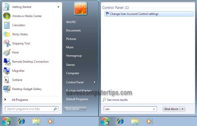
More important than a bright and shiny button is the change noticed when searches are performed from the Start Menu dialog box. The Start Menu changes so the focus is on the results of the search. The entire Start Menu displays search results, which should be easier to read and allow display of the full text on longer results.
When things go bad
Windows 7 offers some much improved troubleshooting options. We’ve all experience times when Windows just doesn’t want to work. Usually accompanied by a black screen and options including “Start Windows Normally”. issues. Windows 7 actually will attempt to diagnose and repair such a problem, which is a pleasant surprise.
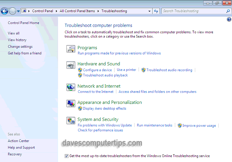
A very nice touch. Microsoft has gone much further though and added a new Troubleshooting applet to the control panel. The new applet helps diagnose and provide useful recommendations for common computer problems including; issues with programs, sound, networking, display, and performance among others.
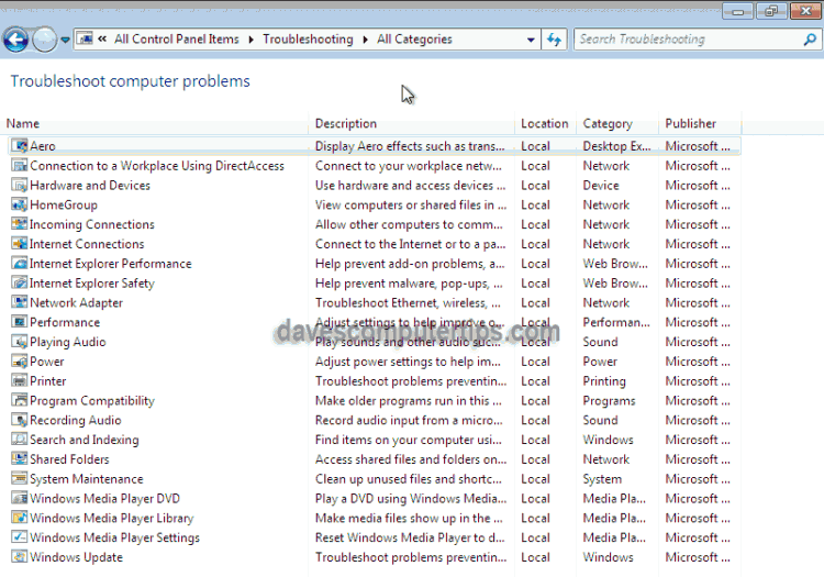
Pretty neat, huh? Well it gets better! Clicking ‘View All’ in the upper left displays all Troubleshooting tools and should cover most user problems. Microsoft can update these and hopefully will based upon user feedback.
I will tell you that the stability of Windows 7 has been wonderful. Many considered Windows 7 ready for release after using the Beta, and I must say that I agree. Hopefully these tools will get little use.
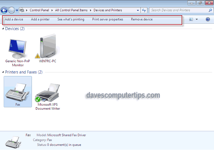
Another new addition to the Control Panel is Devices and Printers, which is commonly referred to as Device Stage. As more manufacturers incorporate the awareness of Windows 7 into their products this will be a great place for users to interact with those devices. A current list of supported devices can be found here.
Device Stage will offer a convenient place to adjust settings, view manuals, update firmware, and perform other device specific functions. Devices that are Windows 7 Aware will display a picture of the device and offer device specific options. This adds to the user friendliness of Windows.
User Account Control
User Account Control (UAC) was added to Windows Vista to improve security by requiring user intervention before changes could be made to key areas, thereby allowing users to operate in a safer limited user account. Definitely a good (though misunderstood) decision, but many lauded the implementation. Microsoft has refined what many called “an overbearing solution” by not prompting for common administrative tasks, thereby reducing the overall number of prompts the average user will see(by default). Further reductions have been accomplished by streamlining processes that generated two prompts.
In addition to the above refinements users can easily adjust UAC to one of 4 levels. The 3rd level is the default and where I would recommend you leave it, unless you have a specific need to change it.
Level 4 – Always notify me when:
- Programs try to install software or make changes to my computer
- I make changes to Windows settings
Level 3 – Default – Notify me only when programs try to make changes to my computer
- Don’t notify me when I make changes to Windows settings
Level 2 – Notify me only when programs try to make changes to my computer (do not dim my desktop)
- Don’t notify me when I make changes to Windows settings
Level 1 – Never notify me when:
- Programs try to install software or make changes to my computer
- I make changes to Windows settings
Windows 7 is the most polished OS I’ve seen come out of Redmond. If you have the opportunity to upgrade you should! If you buy a new computer and have a choice between Windows 7 and XP please choose Windows 7. If you build a new computer, and have an ununsed copy of XP you’re planning to install, please go ahead and get Windows 7 along with your components – You’ll thank me!






Hi,
Thanks for the articles. They are very helpful.
In several of your articles, including this one, many of the picture frames are blank. Clicking on the icon in the frame is still unable to bring up the image. Why and how to fix this?
Your help will be appreciated.
R.Y.
We did have a (web) server issue late last week. It’s possible this was collateral damage from the incident as there were a few other strange things that didn’t work as expected. Just to be safe earlier in the day I re-uploaded all the blog images. I just checked this post and everything appears fine now. Good catch, Rog.
Hey Rog – They are displaying fine at my end. Which browser are you using and what version??
Cheers…Jim
I thought Windows 7 was going to let the user decide which browser would be loaded, or was this for Europe only. It’s not that I don’t want to use IE, it’s the clutter of having all useless files taking up space. I’m tired of being forced to use a special program, when there is superior software to pick and use.
As XP will still be around till about middle of 2014, that’s more than 2 years to find an alternative o/s.
And Dave, that was an excellent article, Mindblower!
That was a EU decision.
i need more notes i you can