When it came time to get my own cell plan and adopt the same device and ecosystem as my coworkers, I was a bit sad to end my 3 year relationship with Android. I knew I’d miss the customizability and widgets of Android, but I looked forward to being on the same platform as those around me. Though during the last two years of my Android love affair, Apple and its iPhone had something going for it that caused my eyes to wander and my mind to fantasize about another phone: wood accessories.
Wood covers and cases have been available since the iPhone 3g, and have gotten sturdier, prettier, and better with each new iPhone. Sure Android is supposedly the most popular OS in the world, but fragmentation (of the many different devices and manufacturers – not even going to get into OS fragmentation…) means no one Android handset is popular enough for wood case manufacturers to justify offering custom cases and skins for the devices. I told myself that if I was ever coerced into getting an iPhone, that at least I’d be able to wrap it in beautiful walnut. I then stopped looking at wood cases I couldn’t buy for my HTC Evo so my smartphone wouldn’t detect any unfaithful thoughts.
My favorite parts of the iPhone are made of wood

As soon as I knew I was getting an iPhone, and before I even ordered one, I shopped online for real wood cases and skins for the iPhone 5. On the day I ordered my phone, I also bought beautiful walnut skins from Carved.com to cover the front and back of my device. The look and feel were great, but the lack of side protection and a few dings on the outer edges told me it was time to get full coverage.
Thankfully, Root Cases offers a two-piece solid walnut case for the iPhone 5. The grain detail and tone of the Root Case is stunning, and the precise fit of the case allowed me to keep my Carved skin on the front. The Carved and Root woods happen to be a similar shade of walnut, and look perfect together.

My iPhone 5 is covered 360 degrees in natural, sustainable walnut, and it definitely turns heads when I’m in public.
The two-piece walnut case from Root Cases brings gorgeous piece of mind

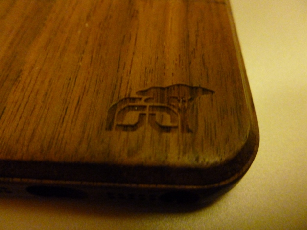
Again, the grain detail and tone of the wood case from Root Cases is remarkable. Sure the case is solid walnut, but that one wood includes beautiful hues of green, red, pink, and brown throughout the surface. The Root company logo cut-out in the bottom right corner on the back is intricate and unobtrusive. In my opinion it adds to the overall appearance, though some might prefer a completely-smooth aesthetic.
The case slides on and fits very snug. It’s thick enough to add some real protection, but not overly bulky to add noticeable heft to the device. The Root Case is the result of great craftsmanship and design, as evident by the soft material lining the case and the clicking mechanism allowing the top and bottom pieces connect securely.


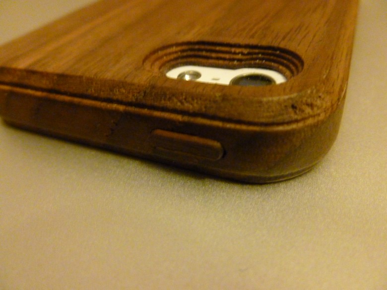
All of the buttons and cut-outs are perfectly centered and functional. The power and volume buttons are covered in wood, but click and respond with the same feel as the aluminum buttons underneath. The tactile response feels great! The lightning 8-pin cable and Apple earphones fit perfectly in their holes with room to spare on either side. I’ve even plugged non-Apple cables into the holes with ease. Though like with any case, earphones and headphones without a small, straight mini-jack aren’t going to fit into the case’s hole. My favorite Klipsch Image x10 earphones don’t plug in all the way with the Root case on, but I just remove the bottom portion of the case when I’m looking for some audiophile bliss.

My wood theme even features OS customization

There isn’t a whole lot I can do to change the look of my software and OS without Jailbreaking my iPhone (I’ve rooted several Android devices before, but I didn’t come over to iOS because I wanted to make things complicated again). Still, my beautiful wood case and skin needed a good lock-screen image and wallpaper to complete the look and theme of my phone. Apple includes a nice stock-image of some tree rings on the iPhone that I thought looked great with my theme, but their wallpapers were pretty lackluster.


I found a great app in the App Store called “Icon Skins and Shelves for the iPhone 5”. I like the look of “shelves” for my apps, putting them on a shelf for display. Since iOS positions apps at the front and center of the homescreen experience, I wanted a wallpaper that would highlight that design in a wood theme. The Shelves app included this great option (above) that I downloaded and applied to enhance the my iPhone’s wood theme. The detail of the shelves is almost obsessive: see how some of the shelves (left picture) have lines in them? Those lines were put there to make a drawer-effects for folders on the homescreen. The right screen grab show you what happens when I click to open the Games folder on my homescreen: the shelf splits precisely at the line. (Nice touch designers: you know what you’re doing.)
After 4 months with the iPhone 5 and iOS, I have certainly adapted. I’m used to the Apple way of multitasking and notifications, I have since come to terms with the loss of widgets, and Google Maps finally made it to iOS a while back. Still, it was the wooden accessories I’ve been lusting over for years that allowed me to fully love my iPhone. When I inevitably change devices again sometime in the (hopefully) distant future, I’ll miss my wood case and skin far more than I ever missed the best software or hardware features of Android.


