I must have been nice in 2013 because Santa brought me Windows 8.1 for Christmas. I consider myself very lucky indeed. Thank You Santa– you know who your are.
Fat Borders
Being the fussbudget that I am, as soon as I got past the drudgery of installing all my programs, utilities and the all-important GAMES, I could finally start putzing with the less important but more satisfying visual appearance tweaks of the new operating system.
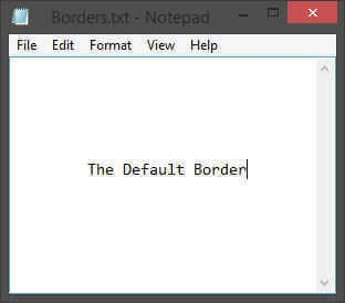
One of the first things I noticed about the windows themselves was that big, fat, clunky-looking border:
They are almost reminiscent of the circus-looking, garish XP days. Do programmers generally have poor eyesight? Could be…
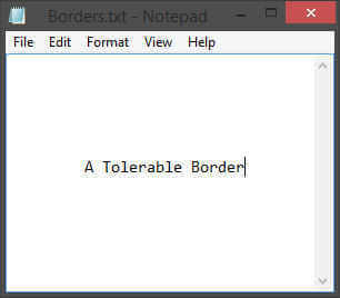
There is no practical need for them and I simply prefer a more streamlined appearance. I’d choose to have them even thinner if I could find a setting for it.
Of course, there are always the extreme among you who happen to like things big:
This would drive me utterly mad and I would no doubt soon be counting sheep to stay awake.
I found three ways to “fix” this. One costs a little money and the other two are free. Which course you choose depends entirely on your set-up, your mind-set, and/or your set of wallets.
The Money Option
Windows handles multiple monitors quite well, but there is a whole new world waiting out there for those of you who would try out a dedicated manager.
I have three monitors so quite some time ago I decided to get a dedicated multi-monitor manager. The one I decided on was DisplayFusion produced by BinaryFortress.
It has all the tools you need to handle multi-monitor setups, including a Windows 8 specific set of options. Guess what? There is an option to make those big, fat, clunky-looking borders go on a digital diet.
If you have a single monitor at your disposal then the above becomes a moot point and you may ignore it.
Disclaimer: I am in no way affiliated with BinaryFortress nor will I be remunerated for this suggestion. I simply love the program and am passing it along as another option for you to consider. I happen to think it’s a great piece of work.
The Free Option(s)
Tiny Windows Borders
Apparently, I am not the only one who didn’t like the overweight borders because there is a little utility that will change this for you. It is called, oddly enough, Tiny Windows Borders. How they ever came up with something as clever as that, I can only wonder. I must admit that it is an improvement over Microsoft’s capability in that department.
In all fairness, I have used WinAero’s products in the past and found them useful and bug-free. I don’t expect any problems with this utility either.
In any case, it requires no installation and according to the change log, the latest version will not force you to re-boot your computer to see the changes. Sounds pretty slick. I haven’t tried it, so if you do, please let us know if you are happy with it. Here’s a link to the awesomely named Tiny Windows Borders download page.
They even have a little video to show you how it works. Cool!
Registry Hack
There are ways to change the windows border sizes in the Registry. I am not going to go into that here due to the risks involved and some time constraints. Anytime you mess with the Registry you stand the chance of making Windows angry. It will throw a tantrum, kick its electronic heels into the carpet, and won’t start anymore. Take that!
Perhaps, in another article, I’ll show you how. It’s pretty straight-forward for those who feel comfortable editing the Registry.
How Happy I Am
It may seem like a small thing to most of you, but shrinking those big borders down to size made my day. Before, once I saw them, that’s all I could see. Now, I don’t notice them, as it should be.
The next thing I’m setting my sights on is that ugly Start Screen background. They let you choose an ugly background, then adjust its ugly colors until you find one that you dislike the least. Reminds me of voting…
Stay tuned,
Richard


Hey Richard,
When I first saw the title, I thought you may have people renting a room who need to go on a diet. 🙂
Absolutely priceless!!
funny and poetic… “Before, once I saw them, that’s all I could see. Now, I don’t notice them, as it should be.” Thanks for the article!
Thanks NewKreation 😉
I’m glad you found my little ditty amusing,
Richard