Where Do You Keep Your Start Button?
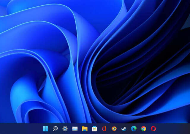
Of all the changes in various Windows iterations, the Start button has always been a bone of contention. Since it was first introduced in Windows 95 all those years ago, it has remained bottom left ever since, with the possible exception of the debacle known as Windows 8 which itself suffered from extreme tile-based schizophrenia, but that’s another matter entirely. You could of course reposition the Taskbar, on which Start actually sits, to the side or the top of your desktop, but the default position has always been bottom left. Windows 11 changed all that and put it in the center, a move that upset many Windows die-hards, even though Microsoft kindly gave us the option to position it at the bottom left by right-clicking on the Taskbar.
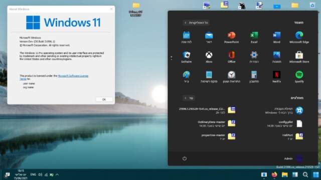
Some may be wondering why there isn’t an option for placing Start at the bottom right, which is something that’s never occurred to me, only because most Western languages are based on reading from left to right. On the other hand, Arabic, Hebrew, Farsi, and other ancient languages are read from right to left, so those versions have Start on the bottom right.
But I digress shamefully because in spite of slamming Windows 11 as being yet another coat of paint over Windows 10, I really like Start being centered and have it like that on all four of my Windows machines because I welcome change. Let’s face it, if life were to remain the same, humdrum rhythm, day in, day out, it would be pretty dull, for me anyway.
So, which side do you dress to?
—


I personally like the center. It leaves the left side available for my coffee cup without hiding things.
Even if there is a single desktop monitor; there is more room/space (inches) left-to-right than there is up-and-down. Why take up the already limited room/space from the bottom of the screen by parking the Taskbar there?
Taskbar ‘auto-hide’ feature used to maximize content of a page, regardless of its horizontal or vertical location. Unfortunately, the new Windows11 has even managed the bungle-up the way open applications are displayed by the Taskbar, which makes the usability of it even less desirable for my needs.
I like the menu on the left – it’s always been on the left and the default option should have been to leave it on the left and allow you to move it into the centre if you wanted to or were used to the Apple way. Microsoft never ever apply the adage If it ain’t broke don’t fix it.
Anyway I moved my Start Menu to the left then simply installed and ran “Open Shell” so I get a familiar and recognisable start button and menu every time. I recommend it to anyone who gets cheesed off because Microsoft continually tries to change things like the Start button just “because they can”. And you should see how excited Windows 11 gets when you fresh-install Windows 11 and then go and delete Edge for another choice of browser. It almost throws a tantrum.
Marc you are completely right – Windows 11 is just a dab of paint and wallpaper and a few piddly changes over a Windows 10 body trying to fool us they created something new.
Like Reg Watson, I use Open Shell, a fantastic open source program, better than any of its “free” and paid competitors. I have used it (or its predecessors, Classic Shell and Classic-Start) to restore Windows 8, 8.1, 10 and 11 start menus back to Windows 7 style in the lower left corner of the taskbar without those ridiculous tiles. I also dislike Apple macOS X and Google Chrome OS with their taskbar-centered start menus, just as Microsoft has now done with Windows 11. Likewise, I dislike Ubuntu Linux with its Unity desktop, which places its taskbar on the left side of the screen. Linux Mint fixed that with a Windows 7 style start menu on the lower left corner. I guess I don’t like much change on my computer desktops.
I’ve yet to use Windows 11 but I will say something that may shock some readers. I didn’t mind windows 8.
Okay, I mean the start menu. Windows 8 had a lot of issues but the start menu was basically just there just different. I preferred the old way but I got used to it.
I do believe that change can be a good thing and if Microsoft are offering multiple ways such as allowing the start menu to be on the left, then it seems like a win win.
Peter. As another lover of 8.1, I replaced that start menu with Classic Shell Menu. After reading that there is a better replacement Open Shell, I will be trying it out, Mindblower!
Don’t get me wrong I didn’t love 8/8.1 but I didn’t think the start menu was as bad as people made out. It wasn’t that it had gone just had a design change.
I do prefer windows 10s version. As others have said, windows 8 felt like a good desktop os for tablets and a good tablet os for desktops.
Open Shell is just the continuation of Classic Shell after the original author abandoned it.
I prefer the center. When I fire up one of my Win 10 machines now, it feels strange to have to go all the way to the left for the Start button.
Windows 11 is a lot more than just a “coat of paint”. It is superior to 10 in many ways. Things just go faster, especially the Windows updates which are much smoother. The settings are much easier to navigate too. These are just a few of the improvements. I have no issues with the taskbar.