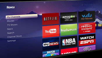
If you noticed as I have that the Roku device Home Screen has become cluttered with things that don’t interest you, it’s not your imagination. Ever since version 12, your Roku device Home Screen has been changing, adding things you may not need or want. In this article, you will hopefully find how to make the Home Screen more to your liking.
1st – Check Your Roku Software Version
As I write this my Roku software version is at 13.0.0. For this article, it’s important that your Roku software be at that version or higher or the suggestions here may not be available to you. So from the Home Screen use your remote to go to:
“Settings” > “System” > “Software update”
It should be Software version 13.0.0 or higher. If not, choose “OK” on your remote and it will “Check now” so it can be updated.
2nd – Expand The Home Grid
Until version 12, the Home Screen has always been three columns wide with an advertisement along the right side. With version 12 came the capability to choose to have the Home Screen four columns wide by making each Home Screen app icon smaller, but the advertisement will still stay at the right. Try this change to four wide and see what you think:
Go to “Settings” > “Home Screen” > “Tile Size” and choose “Smaller“.
This will make the Home Screen vertically shorter. If you don’t like it, go back and choose “Larger“.
3rd – Delete Shortcuts
For a long time, Roku has had two shortcuts on the Home Screen; one is to add channels and the other is to turn off the TV. The “TV Off” capability is only useful if you happen to have a remote control that does not have that capability. Here is how to remove this shortcut:
Go to “Settings” > “Home Screen“. Under the “Menu Items” will be listed “Live TV“, “What to Watch“, “Sports“, “Featured Free“, and “Shortcuts“. You can “Hide” whatever you don’t need. You will find that after hiding what you don’t need the “Home Screen” will probably contain all the options along the left edge without scrolling.
4th – Get Rid Of “What’s Streaming” Recommendations
You may have noticed the “What’s Streaming” Recommendations near the top of the Home Screen. I find these recommendations useless and annoying. Here is how to get rid of them:
Go to “Settings” > “Home Screen” > “Recommendation rows” and choose “Hide“.
Hopefully, your Roku Home Screen will now look better by not being cluttered with things you don’t need.
Your feedback on this article is welcome. Please use the Comments section below to respond.
—

Stuart, thanks for the suggestions. I like the Tile Size > Smaller and now I see more of my items at a glance on the home screen. Take care.
Hi Joan,
Thanks for your comment. I’m glad my article was helpful.
Stu