A few months ago, I wrote a post about my impressions with the Android version of the wonderful cross-platform productivity suite SpringPad. The App and corresponding website have gone through many changes since then, both in design and function. The new SpringPad still aims to do what it has always done best—giving you the tools and the space to make organization and planning fun and fresh—but now they’re going all Web 2.0 by adding some serious social interaction and integration. Think Pinterest. Think Tumblr. Think if Pinterest and Tumblr were a couple and couldn’t get pregnant, and along comes SpringPad to provide the surrogate womb. The SpringPad refresh takes our notes, links, images, and recipes from their spot in our own personal organization haven and creates for us a cloud of content more like a Pinterest or Tumblr where everything we have hand-picked from around the web (or created ourselves) is visible as a sort of webpage-representation of our selves. In true 2012 fashion, the new SpringPad allows other users to “follow” your updates and have access to browse through your “notebooks.” The aim here is clearly to get people spending more time on SpringPad and with their SpringPad apps. Whereas the previous SpringPad design invited you to get in and get out quickly, leaving your ideas in a central location for later reference, the Social SpringPad encourages users to take time in making their ideas look pretty to others. Just what you needed: another social space on which you spend hours a week updating, posting, and perfecting—out of fear of not being the prettiest girl at the dance.
If you’re visiting the site for the first time, you’ll be prompted to sign up for a new account or with an existing facebook or twitter account, which is quickly becoming the new standard around the web. I have some mixed feelings about the increasing social integration on the web: on the one hand I’m not so sure I want to give out Facebook info to anyone except trusted friends, but on the other hand making a new account for every web service is not only tedious and superfluous but increasingly archaic. This sort of social integration is a double-win for web companies though: if you sign up for a service using your Twitter or Facebook login, that service not only turns over account security responsibilities to the Social Giants, but they also (typically) gain some level of access to your social networking lives, thus increasing their audience and gathering valuable information on your internet habits. So if you’re signing up for SpringPad for the first time, you’ll have to make the choice between creating a new account or linking SpringPad to your Twitter of Facebook accounts. Personally, when given the option, I link web services to my Twitter account because it has much less of my personal information, and I’d rather have random Twitter followers than random Facebook friends.
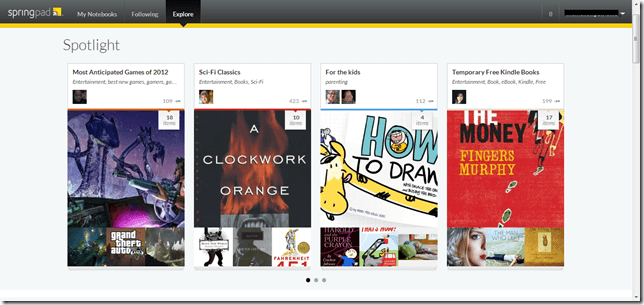
Make no mistake: the new SpringPad is beautiful, well-thought-out, and very functional. In the screenshot above, you can get a sense of the importance of Notebooks in the new SpringPad. In the older version, you had a desktop onto which you could drag and drop your various collections of notes, pictures, etc. Now, the Notebook is the focal-point. Similarly to the sharing capabilities of Google Docs, SpringPad’s new notebooks allow for a wide range of sharing and browsing options, and group collaboration is very easy–even encouraged. These featured notebooks have lots of contributors clipping pics and links from around the web. Users can also follow notebooks to receive updates when something new is added. Like with Pinterest, there are certain community notebooks for popular categories in which everyone is welcome to contribute. See the “Sci-Fi Classics” notebook above: 423 people have either subscribed to or taken from this notebook, which has had 10 items added to it.
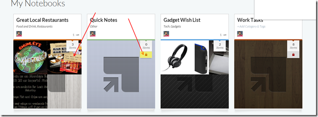
 Here is a look at a few of my notebooks. Notice “Great Local Restaurants” and “Gadget Wish List”. Both of these notebooks are public, so anyone can look at them, subscribe to them, or even add their own content. Those are also the notebooks in which I’ve taken advantage of SpringPad’s Spring This button. It’s a browser-extension plugin that allows you to quickly turn anything into a post in a SpringPad notebook. It even grabs pictures for you! Now anyone who comes to my SpringPad site can see all of the great places I like to eat and some of the gadgets I wish I had money to buy. But what about my own personal notes? Do you see the little lock icon in the ‘Quick Notes” and “Work Tasks” notebooks? That little icon appears on private / personal notebooks, or those you don’t want to put out for the world to see. I have been using SpringPad as my personal remember-it for a while now: anything I want to remember or work on later gains a spot in a notebook I’ve titled “In Potentia”. I keep my In Potentia notebook close by my side but far away from the eyes of others, and SpringPad has given users an easy method of controlling what we share and what we keep private. Further, if you’ve been using SpringPad from before their Big Social Redesign, your previous notes will be added to your new account as Private Notebooks, so don’t worry about any of your private thoughts going public as you make the switch.
 The SpringPad App has also gotten an overhaul to cater to the new Notebook-centric, social design. This is what the app looks like when you open it up. You’ve got your most recently used notebooks front and center. The three lines in the top-left corner work as a menu button, much like in the latest Facebook app. Touch the button and a side-box pushes its way into view, bring with it options to create a new notebook, add to existing notebooks, and a list of your most used notebooks. Click on a Notebook, and the side-box will populate with information as to who has contributed to the Notebook and what types of content can be found within the Notebook. Though I haven’t tried it on one, the screenshots from SpringPad’s Google Play page suggest that the app would look and operate beautifully on a tablet. In short, like the website, SpringPad’s mobile apps have gone through a great deal of change, focusing on social notebooks, becoming at once simplified and more complex.
http://www.youtube.com/watch?&v=biAl_nnwf6U
To recap, SpringPad has changed. They’ve gone social. They’ve become more focused. They’ve put a lot of thought into creating their brand. They just really, really want you to spend a lot of time with the new SpringPad and to love it like you do your Tumblr blog or your Pinterest wall. It looks great. It works well (for the most part). But I still feel like this is a bit too much too soon. I loved SringPad in its original incarnation; I was extremely sad to lose the Android Widget. For me personally, I don’t want my organization to be more social. I don’t want others seeing how productive I am or am not. I don’t care to contribute to group or community Notebooks anymore than I care to help a stranger plan her monthly budget. For me, Springpad was always about being able to quickly and efficiently organize and access my thoughts, goals, tasks, etc. from anywhere. That functionality hasn’t gone anywhere, and the new website and design even look much better, but forgive me if I don’t care enough to find and clip High Definition pictures of red onions just so I have the prettiest grocery list on the block.


