You Can’t Cut Corners On a Learning Curve
 I thought I would cover my experience with the Windows 10 Pro Technical Preview. By the way, why is it that some of us feel the need to add grief to our life by trying Beta software when the regular software is difficult enough to figure out? My guess, probably an insatiable need to discover the new, or a way to feel like your leading the pack.
Whatever the real reason, what I have learned along the way is that you cannot cut corners on a learning curve. That is unless you don’t mind the cost or toll you pay in knowledge. Whenever I try new software or hardware, I try to use a systematic approach so I can fully understand how each part of the program might have a real value for me or how it might be a “major improvement” only in the eyes of the developer.
First of all I am using windows 10 Pro Technical Preview Evaluation copy build 10049. Each build has improvements supposedly based on comments from evaluation users and Microsoft Development teams. I mention this because the final build may be significantly different in its final look. So with that in mind, let’s take a look at the beginning.
When you start up Windows, it defaults to what it calls a Lock Screen. This is a screen just prior to the Sign In screen shown in. You have the choice of setting it to a static image like the one shown in or having the images perform a slide show.

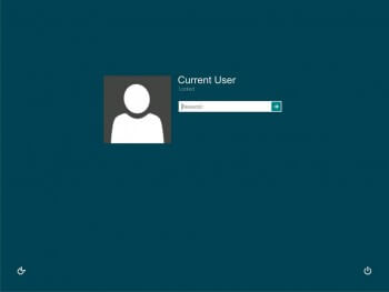
The first input screen you see is the “Sign-In” screen. It is where you enter your Microsoft account with your username and password. This has the added benefit of instantly loading your contacts, calendar, and mail. If you use the Microsoft App Store or Xbox Apps you are also signed in. An added feature is the ability to check for internet connections at this window. I’m sure a helpful addition for laptop computers. I also like the ability to shut down the system from the sign-in screen in case you decide to stop the loading process.
Once you log-in, you will notice that Windows 10 tries, in my opinion, to use the best of Windows 7 and 8.1, by giving you the options of having a Regular Desktop, a Start screen minimized or a full Start screen.
The “Start Screen” in Windows 8.1 has now been transformed into a multiview screen with the start screen and desktop viewable together or you may expand it to full screen.
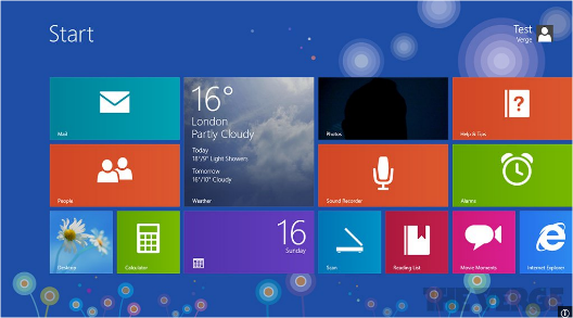
In this view it is shown with the start screen minimized.
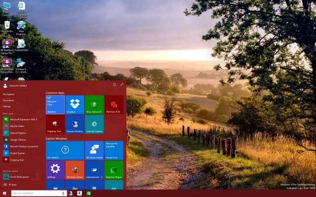
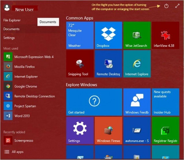
In either view, you have the ability of making three tile sizes , small, medium and large. Currently there is no option to make one as large as the weather tile in the 8.1 version. That may change is future releases. In the magnified view below of the minimized start screen, you can now see the file list, similar to Windows 7 at the left side of the screen.
Quick Access List View
In the “Quick Access List” there are three settings;
You can fill the entire screen as it was in 8.1 but it is now slightly transparent so the desktop is always visible behind it.
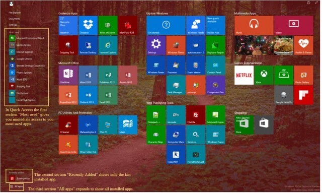
The first section is called “Most used” where all your frequently used programs are listed, preventing you from having to scroll through the entire list to find your program.
The second section is titled “Recently added”. When you first install a program it will appear here. You will have the ability to adjust the number of recently added files that are visible at one time.
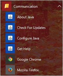
Finally the third section is titled “All apps”. This is a bit misleading in the sense that not every program or app you have is automatically placed on this list. I have not yet found the criteria that Microsoft uses to determine if it is loaded to the “Quick Access List” but is does give you the ability to include them if you want.
Once you click on “All apps” an alphabetical list of applications, programs and folders appears. You may scroll down the list and select any file. If a down arrow appears it will open a sub menu of the files contained within.
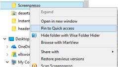
To change the items that appear in the Quick Access List you need to open File Explorer and navigate to the application or folder you wish to include in the Quick List.
Simply right click on the app or folder and select Pin to Quick access. In addition to you my choose at this point to pin it to the Start screen as well.

Windows 10 Task View
Another nice improvement in this version of Windows is the Task View icon on the Task bar. If you are only half as lazy in closing programs, as I am, you may like this feature.
Simply clicking on the Task View Icon or hitting the legacy “Alt-Tab” keys, you will be presented with a panoramic view of all your open programs. This is much nicer than scrolling through a bunch of tiny square icons, with every press of the tab button. The window sizes in Task View are representative of your actual program and automatically resize depending on how many open programs you have at one time. I use two monitors while working and I imagine that with more monitors you would see them spaced accordingly .

Cortana
I won’t go into in-depth detail with Microsoft’s newest venture but would like to discuss it because I think it brings the ability to search your computer and internet with the same ease as doing so with your phone. To me it is like talking to Apple’s “Siri” only asking her big sister. Clicking on Cortana and entering text is basically the same as entering a search in previous versions of windows but a feature more commonly associated with phones and tablets makes it no less desirable on a desktop.
The power of Cortana comes from speech. It will listen to you and talk back. You may ask it just about anything and if it cannot find exactly what you want it will make the necessary suggestions to search, “Your Stuff” or the “Internet”.
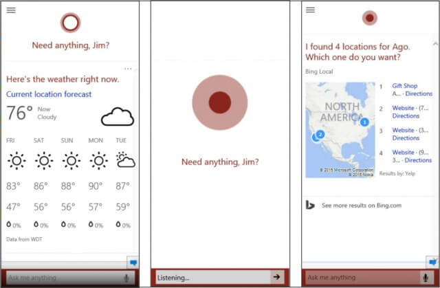
When you click the white circle on the task bar the first thing that scrolls up is any information you preset like news, weather or internet sites. Just choose what to display. I have mine set for my local weather. I may at this time click in the white box and start typing.
I can click on the microphone and the window will indicate that it is listening for a response.
The results displayed depend on if Cortana heard clearly. If it did not it will offer suggestions and will do its best to load up meaningful suggestions for you to choose.
The speed of the results is impressive, I think the tool can still be improved upon but it is a new refreshing way to search for the desktop users.
Spartan (as in not much here)
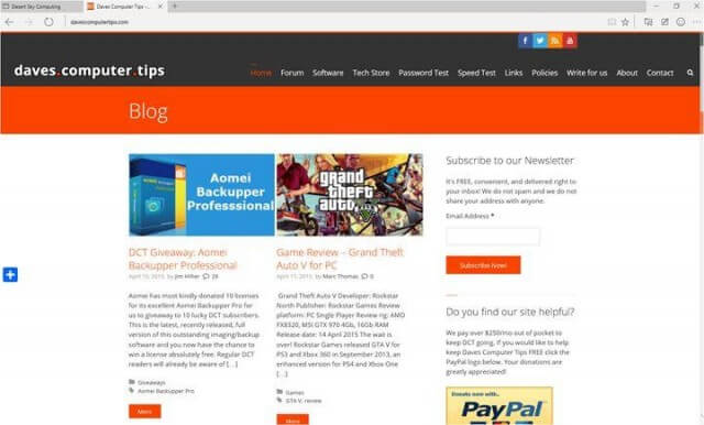
That title is not meant as a negative. I received my copy of Spartan in the last build 10049 and aside from the early edition bugs I like it. It has a nice clean look and feel to it. There really is not much cluttering up the page when you open Spartan. Let’s get, what are to me negatives, out of the way first.
The first is the absence of a home button. It is a bit bothersome, I am just comfortable clicking on a home button to perform another search, but this is something I believe they will add one soon or I will learn to work around it.
The second item is once again personal preference. Double clicking on the title bar does nothing. Unlike all other window programs it will not minimize or maximize by double clicking. Yes the standard min/max/close buttons on the right side are still there but a slight inconvenience nonetheless. That’s it! The rest delivers a clean feel throughout.
Windows 10 Setting Menus
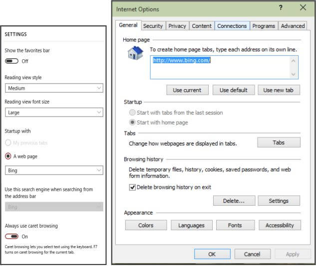
The settings menu is now a very simplified drop-down with only the necessary choices. Compare this to the very complex multiple choice menu from Internet Explorer 11. Did you every feel you had the optimum setting?
Address Bar Change
Another thing I noticed is that the address bar is actually just part of the top of the program. Unlike other browsers that have separate address bars, Spartan melds it into one smooth feel. Other than looks it has no advantage over any of the other browsers. Take a look at the group below.
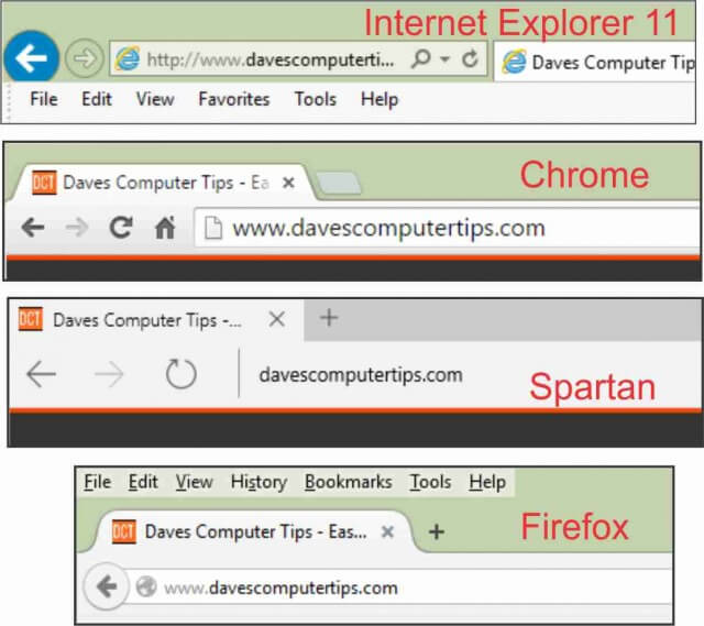
 The right side of the browsers all have a sameness to them. Spartan has replaced the gear in IE11 with an ellipsis … The Happy Faces are only a temporary addition for technical preview reviewers.
The only major difference is the square with a pencil in the Spartan version. This new feature opens a new toolbar that gives you the option of entering highlights or drawing images directly on the web page, best used with touch screens, but workable with a mouse. There is also a text based note insertion tool that is easy to do on a keyboard.
The last feature allows you to select a region on the page and copy it to your clipboard. Nice not having to leave the program and get your Sniping tool.

Make Notes or Draw On Webpages
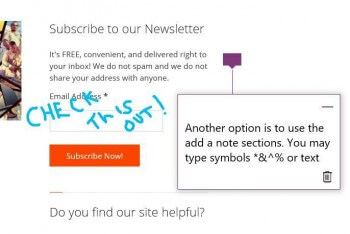
In the screen grab below, I have used all of the features mentioned on the left of the toolbar. The right side gives you the additional options of saving the page to read offline or sharing it with someone else. A major downside is the eraser only allows you to “clear all” so once you add something you don’t want you have to start over. This is a great feature when you spot something on the internet and want to share it with a friend. Just write your note, capture the area and send it along.
There is more to Spartan than shown here but I think you get the point. Microsoft is trying to give a new feel to your browsing experience by handling everything behind the scenes. Even the download function is streamlined and not having to make all the decisions of what settings should I really choose is perhaps the best improvement made.
Summary
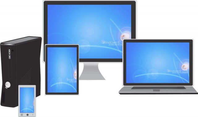
Unlike previous releases of Microsoft Windows, there appears to be a concentrated effort to involve serious input form both developers and users. This alone make this version unique. More to the point is it worth going from Windows 7 or 8.1 for that matter. I believe the answer is yes. The seamless crossover between all your electronic devices from phones, tablets, laptops, desktops and the ability to use Xbox on any one of them is the way of the future.
How do I feel about this new version of Windows. Well honestly, I would buy a copy as soon as it was available, but Microsoft will be offering Windows 10 as a free upgrade to qualified users with new or existing copies of Windows 7, windows 8.1 and Windows Phone 8.1 devices that that upgrade in the first year! And according to the Microsoft website it gets even better, they will keep it up to date for the supported lifetime of the device for no additional charge. Sign me up!.
Excellent article Jim.
I’ve been running preview for a while now and am up to 10074 as of yesterday.
For me, the big changes are how MS have listened to those users like me who found 8 so awful.
This is much more intuitive and it sure is fast! I’m still playing with it, the bottom line being ease of use and running the latest AAA games, which I’m still testing out.
Either way, I can see a huge take up of 10, especially when you factor in the free upgrade.
Although I have not done full fledged installs on a dedicated machine I have been playing with most of the builds including the latest 10074 in a virtual machine, and yes I have to say I am impressed, I really think Microsoft will get this one right.
BTW, Project Spartan is now called Microsoft Edge.
Since the release of 10074 I have had my first problems with Windows 10. Being on the fast round, I kind of expected this to happen sooner or later. There seems to be a bug in this release of Cortana. I have had to reload 10074 twice. The second time Spartan would not load at all. Hope the third time is the charm. Right now everything is running smooth, wow, did I just jinx myself.
Tiles, tiles, and more tiles. Big tiles, little tiles. What’s with the ugly tiles? I’d like one more options for the little buggers: Go Away.
I would like to see a shot of Windows Explorer. Please tell me it still exists in Windows 10. Please tell me I can still make folders, move files around, etc., etc. How customizable is Windows 10? How many apps does MS allow users to run at the same time? Can they be sized to suit the user or must they be run full-screen?
Also, I am very concerned that Windows 10 will become a subscription service. Any news on that topic?
I am not complaining about this article. I understand it was not meant to be all-encompassing. I’m just making stating a few things I’d be interested in reading about in future articles.
There is no “news” on that topic Kell, only conjecture. In my opinion it is inevitable, and MS has provided yet another clue by recently announcing that Windows 10 would be its last operating system, mentioning the term “Windows as a service”.
Hmmm.
Kell, sorry for the late reply, as far as Windows being a subscription based program, it is as Jim Hillier mentioned, speculation. I don’t know if anyone outside of MS knows for sure.
Windows explorer is a yes, it is still around, frankly I don’t like when they mess with the tired and true but the changes are more “flashy” than practical. Bigger and brighter yellow folder icons are the most prominent change. I have found that I can modify the look to mimic the Windows 7 version. You may move folders and files where ever you like and the quick access tab is a nice addition.
I have not found a limit to the number of apps yet. I am a windows hoarder, meaning one I open one I seldom close them. I am sure I have had many more than 30 open at once but I have 32GB so I don’t know the effect on 4 or 8. I don’t think it would be a problem. You may size them as you wish. As far as the tiles go, I am right with you. They lend themselves to tablets, phones and touch screens much better. In the Win 10 insider group there is a lot of dissatisfaction with the tiles including the size, image on the size and not being able to color them. All things that I feel they will work out.
I have received the next roll out and some have already been addressed. I will follow up with the next version roll out. All great questions, let me know if you want anything specific answered and I will answer. Jim