No Need to be Alarmed
A little over 8 years ago I had an idea – thankfully one of my better ones – to start a website where people could learn about computers. From our meager beginning to the global media powerhouse DCT has become – I may be exaggerating here – it has been a great experience. Great in what ways you ask? Well I’ve met some really great people along the way. I’ve also had the ability to grow my knowledge about “web” things like servers, HTML, and too many other acronyms I won’t bore you with right now.
Over those years the site has matured in step with my knowledge and experience – interesting how that works. We have moved from the most basic of hosting options to modern day powerful VPS servers. We have moved from basic hand coded pages to modern day CMS systems.
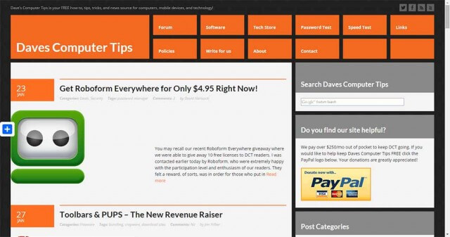
Today is another step in our journey. Things may look a little different, and they are, but all of the functionality remains. A visual make-over would be a fitting description.
Going Forward
I didn’t want to shock anyone by delivering a weekly newsletter that was visually different without explanation, so that will change with next week’s mailing ( February 6th, 2015). There are also quite a few bugs to work out so please be patient as we work diligently behind the scenes to whip DCT into shape.
The most important think going forward is DCT will continue to provide the same great content as before. In fact, we’re working on providing even more content to the reader this year.
Looking Back
Of course, we can’t move forward without looking back at the path we’ve traveled!
In 2006 the site was extremely basic – maybe laughable. Poorly hand coded in HTML with some fancy hover navigation. No need to bring me to task for the bubble graphics!
By 2010 I had invented the notion of “flat design” and while the site was still hand coded it had several dynamic aspects thanks to PHP include statements. We had a forum!
By early 2012 we had moved to a content management system (CMS), which greatly automated the operation of the site. Does anyone else notice a similarity in the site color from 2006 to 2012?
By early 2013 we had adopted a more edgy look – some would say Windows 8-esque – and moved to a much more powerful VPS server.


Your new popup asking to join your mailing list is annoying and does not work properly on the mobile version of your site as it does not have the option to get rid of it when viewing your site on my phone and it ends up blocking the story i’m trying to read.
Your site was much more enjoyable without it.
Rob,
Which OS and browser?
Dave, it is very pleasing to see the ‘moving forward, onward and upward’ changes, it is a great site, and the team beside you are worthy contributors.
It was thanks to marko, Jim, and Freeware BB that I became a member.
To all at DCT, keep up the knowledgeable and interesting posts & tech. assistance.
Regards,
Jon in Oz (Jonno)
All that needs to be said is “thank you”. Your vision in reaching out, assisting others in need and growing in knowledge yourself, is a blessing. Thanks for hanging in and putting up with us, Mindblower!
David,
First I would like to thank you for your hard work and also all your fellow contributors for the great content you provide. I’m fairly new to your newsletter, just under a year now. But I’m glad I found it! I look forward to learning more with each issue.
Robert Taylor
Credit to you Dave, and all involved, its an uphill struggle these days trying to keep sites alive and users on board … Eight years is a formidable number and you should be proud 🙂
I “found” DCT so many years ago I remember a lot of those old postings and have been an avid follower since. I appreciate the great articles that have always been topical and interesting as well as informative.. Thanks Dave and associates
Hi Dev,
Thanks a lot for DCT as I found it very useful. I eagerly waite for DCT every week as each one educates me on some aspects or other in computer operation. Further I found it is remarkable that every query is answered even if it is so basic. Keep going , I am one of your admirer . Thanks to all the staff also who contribute valuable stuff
Raju CM
I think the new design looks good and importantly its simple. A lot of people confuse simple and boring. A good site should be simple and sleek, looking good but not being over complicated but also not being boring.
This site looks just right and should attract new audiences
Progress is good… as long as it’s progress. 😉